When CityLab asked followers on Twitter to choose their favorite examples of public transit seat coverings from around the world, a deluge of replies rolled in, many of which expressed affection for patterns that would make a minimalist shudder. Photo from Transport for London (TfL).
In the 1930s, the London Underground referred to the potentially nauseating effect of a loudly designed fabric on a seat in a moving subway car as “dazzle.” Even if you haven’t felt the uncontrollable urge to vomit from the sight of a wild seat pattern, you have an idea of which ones have such potential.
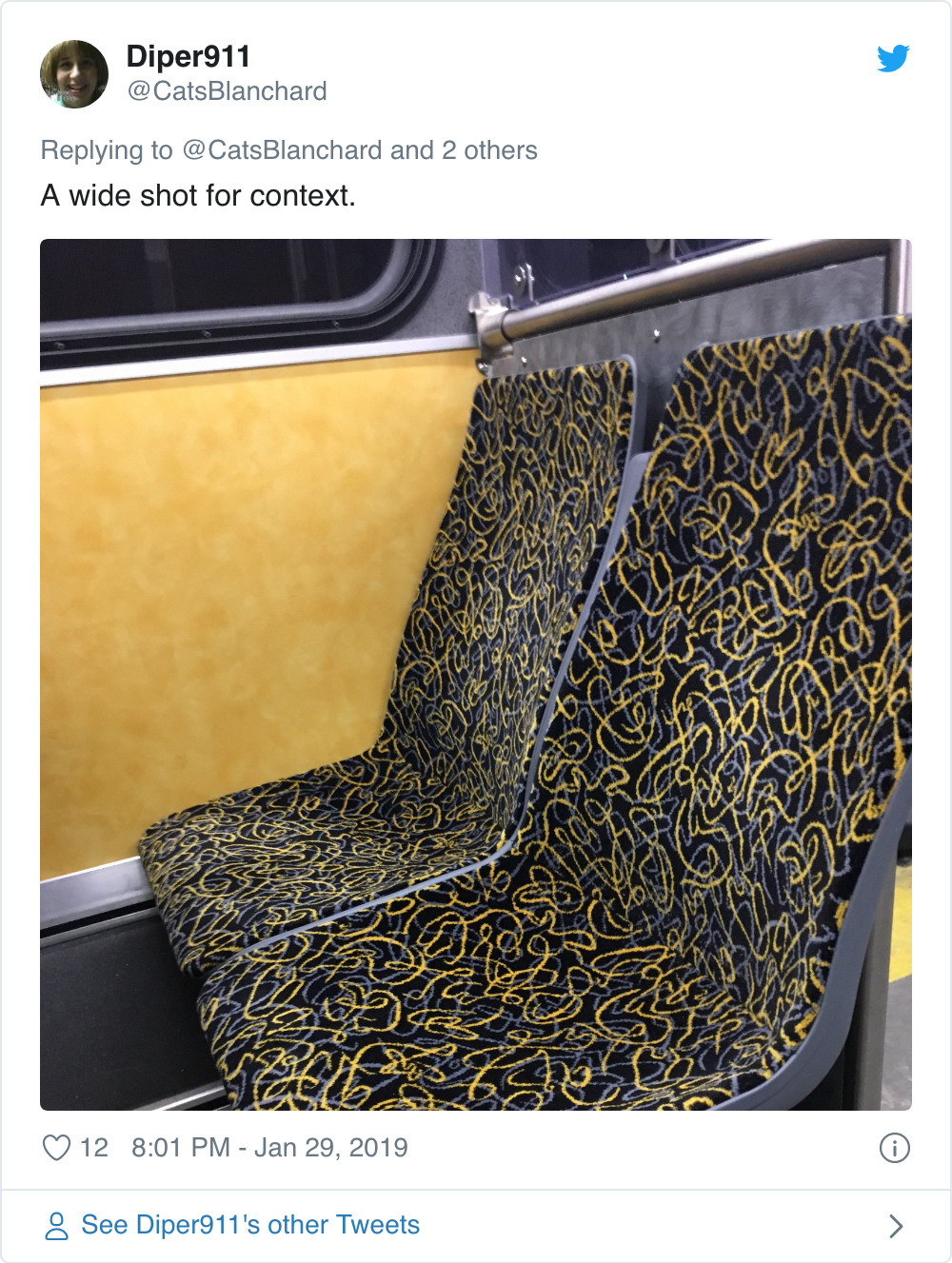
It can’t be easy creating a good textile for public transit. Bus, train, and subway seats must do far more than look attractive. They have to stay fresh-looking as thousands of people sit on them daily, all the while trying to deter or mask the attentions of vandals. With all these boxes to tick, it’s no wonder that so many of the fabrics used on public transit are, quite frankly, pretty damned weird. Often the textiles chosen—usually, but not exclusively moquette—have an eye-grating brightness and busyness that would make the average person faint (or at least laugh) if they saw the same pattern used for a shirt or curtains.
That doesn’t stop people from loving them. When CityLab asked followers on Twitter to choose their favorite examples of public transit seat coverings from around the world, a deluge of replies rolled in, many of which expressed affection for patterns that would make a minimalist shudder.
Looking over both the replies and moquette appreciation sites (yes people, these are in factlegion), CityLab has put together what we reckon are the important criteria for creating a good seat cover. We’ve also narrowed down the ways public transit answers this brief to four classic responses.
Seat cover designs, we believe, need to consider four things:
Memorability. They need to be striking enough to create an instant impression.
Freshness. Moquette needs to be bright enough in color to appear new(ish) after years of wear, but not so pale as to make stains or fade evident.
Intricacy. Large empty monochrome spaces show wear more quickly, and provide too tempting a canvas for vandals.
Anti-Dazzle. Moquette shouldn’t be so bright and busy that it turns stomachs.
Generally speaking, there are four classic ways to respond to these four stipulations:
Keep it Traditional
Creating a bright, intensely patterned cloth doesn’t necessarily mean going avant-garde. Some of the most iconic designs for public transit nod to traditions. Fabrics used on London’s tube trains and buses clearly reference tartan (British people never say “plaid”), a fabric that, while Scottish rather than English, at least comes from the same island.
It’s a perfect choice as a template, creating a clear house-style
that still allows for infinite variations. London’s moquettes are bright
enough to be memorable, but subtle enough to stand on their own two
feet as furnishing fabrics, something they have actually become.
No other network has reworked traditional textiles to the extent that
London’s has, but there are still some great examples from around the
world. This delightful bus seat cover from Krasnoyarsk, Siberia, likewise lifts a pattern commonly found in traditional Russian wall hangings
This Japanese train seat design
has a traditional pattern that looks luxurious, but has been subtly
altered to give it greater wear. The white background of this design
could stain easily, but it has been covered in pale grey dots that break
up the monochrome areas and make any mark less likely to show.
Istanbul’s Metrobus system arguably struck gold when they hit on this
traditional tulip design in deep blue, eggshell, and grey, although the
relatively somber colors mean this moquette already looks a little
tired.
Modernist Abstraction
Some of the best moquettes junk the traditional, going instead for
hard-wearing, eye-catching abstract prints. Take the seat covers on
Oslo’s Metro system as an example. They may not be that
distinctive but their grey background will take a lot of wear before
looking streaked or nasty; the pale turquoise oblongs, meanwhile, keep
the fabric looking bright and fresh without adding any unnecessary
glare.
This cosmic spaghetti from the Pittsburgh bus system is a curly, doodling version of the same thing, and equally effective.
The Modernist abstract approach can sometimes appear drab. The same
approach with the volume turned up to 11 can nonetheless take transit
to a pretty wild place.
Take
Berlin’s BVG, for example. The subway, tram, and bus system has a major
problem with vandals who don’t just tag seats with markers but scratch
words on the windows. The BVG have thus chosen plastic seat coverings
for its subway trains with a broken-up, writhing pattern expressly
designed to be an unsuitable background for scrawling on.
The result is like hysterical camouflage designed for a Day-Glo alien
planet. It’s loud, but the components are small enough to tame the
pattern’s dazzle, making the BVG’s seat covers internationally
recognizable.
Berlin’s “alien camouflage” covers in their natural habitat. Notice also the Brandenburg Gate print on the windows, intended to deter vandals. Photo from North West Transport Photos/Flickr.
Get On, Tune In, Drop Out
Many systems eschew the Modernist abstract approach for something far more glaring and swirly. Seat-cover designs from around the millennium often take a decidedly psychedelic turn, featuring aurora borealis-like swirls and blotches (often in red and orange) that take furnishing fabric to a level of garishness rarely seen before.
These fabrics have plus points. They create an instant impression and stay fresh-looking for a long time. Their delirious kitschiness is still hard, occasionally nightmarish, work for the eye.
These Belfast moquettes look like a cheap holiday rental bedspread that makes you spend your whole stay with the light off and the blinds down. Boston’s take on the style looks like a diagram of a serial killers brain synapses, while the Melbourne Tram’s streamers and confetti-inspired design summons a bleak reminder of that tear-filled childhood birthday party you had the year Daddy left.
This migraine-made-cloth style may be the worst out there, but there
are still honorable exceptions. The phosphorus glare of these (now sadly
departing) Metro Los Angeles bus moquettes may be harsh, but it is
memorable and distinctively Californian. Imagine Timothy Leary staring
at the too-bright afternoon sun through the spokes of the Santa Monica
Pier Ferris wheel.
Seat Cover Symbols
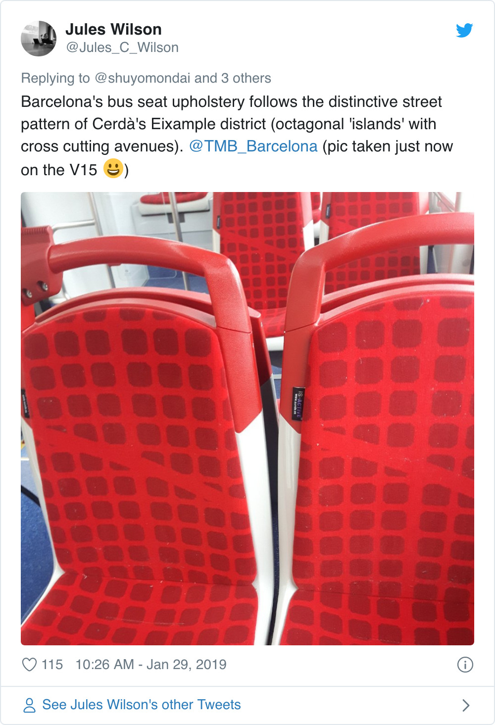
For transit systems that want want something instantly recognizable,
incorporating explicit references to your host city is a common
approach. Barcelona’s buses do this brilliantly. Anyone who knows the
city will recognize their seats’ grid pattern as a map of the city’s Eixample district, the bisecting line referring to Barcelona’s great crosstown avenue, El Diagonal.
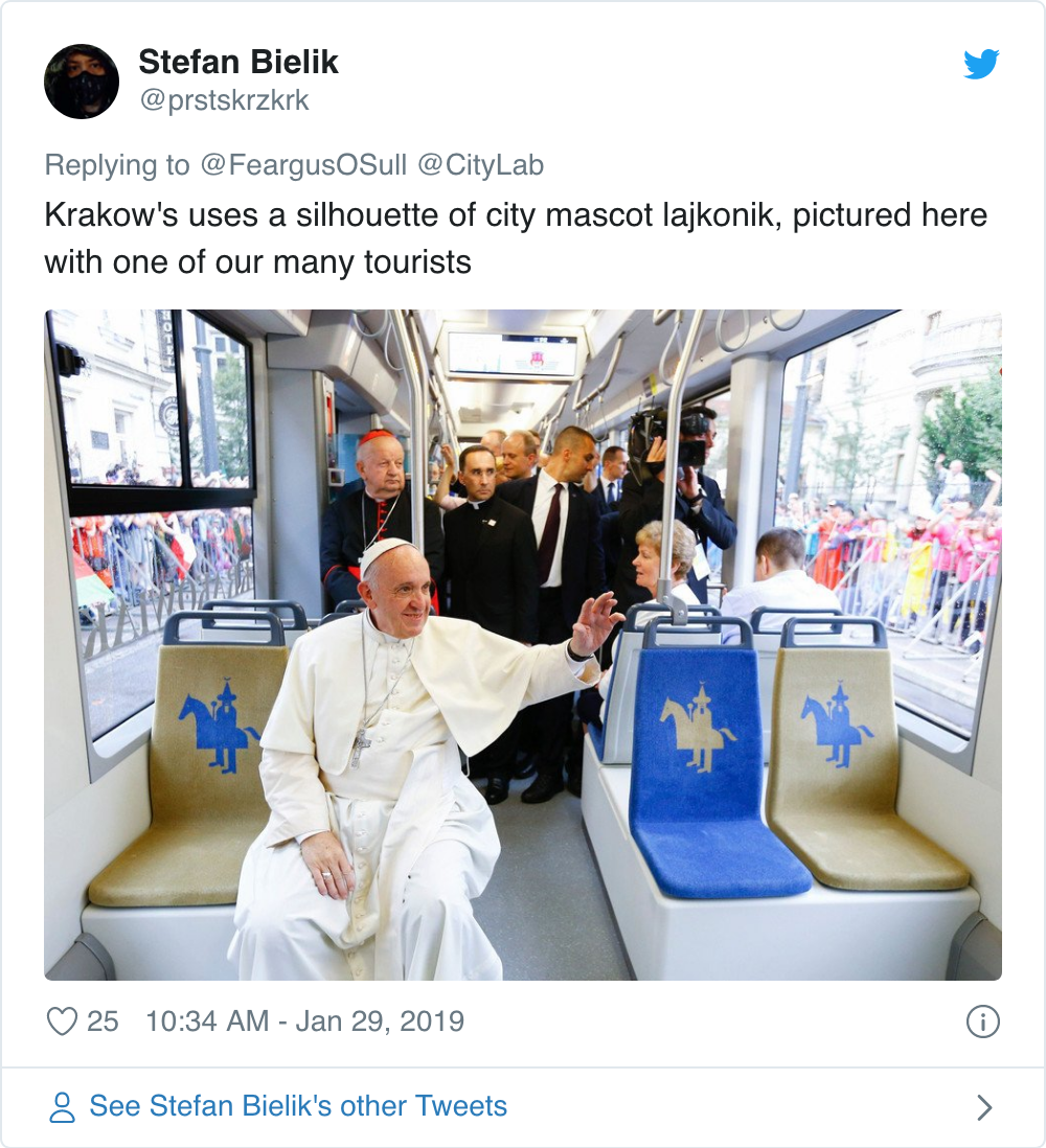
Trams in Krakow have their seat moquettes stamped with the unmistakable silhouette of the city’s Lajkonikhorsemen,
hobby horses of disputed origin that fill its Market Square during a
June festival. These unquestionably look great, but they do leave large
areas of single color that look easy to soil.
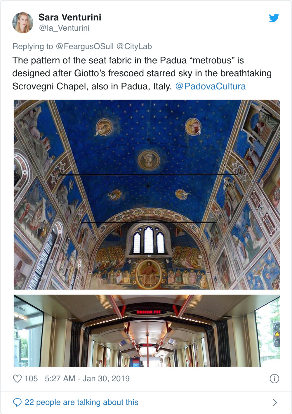
Occasionally, the references are so subtle that only locals would get
it. You might need to know Padua to realize that its Metrobus seats
evoke the starred ceiling of the Giotto-painted Scrovegni Chapel. The result is gentle and understated, but is has some magic to it and is a nice nod to locals in the know.
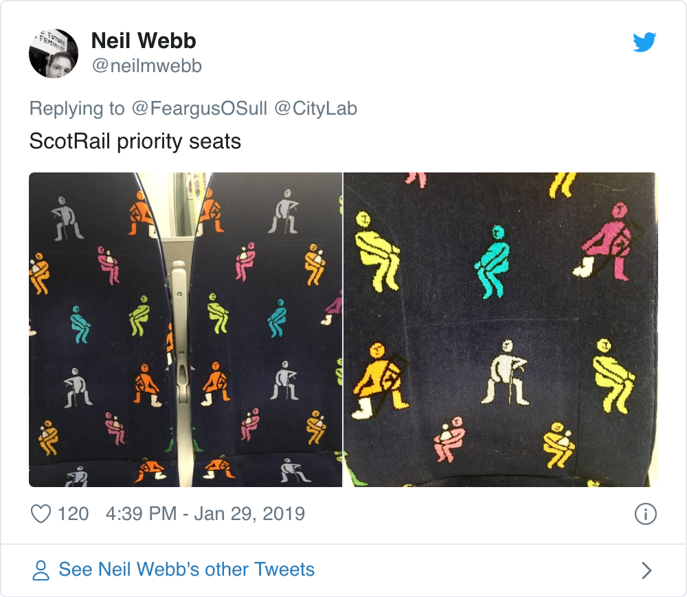
Finally, there are functional symbols that clarify what a seat is
for. The most common of these are priority seats, perhaps the best of
which around are these colorful covers from Scottish rail company
Scotrail. Sure, they give the impression of being covered with images of
women apparently caught mid-poop, but they’re lively, dazzle-free and
make the seat’s function very clear.
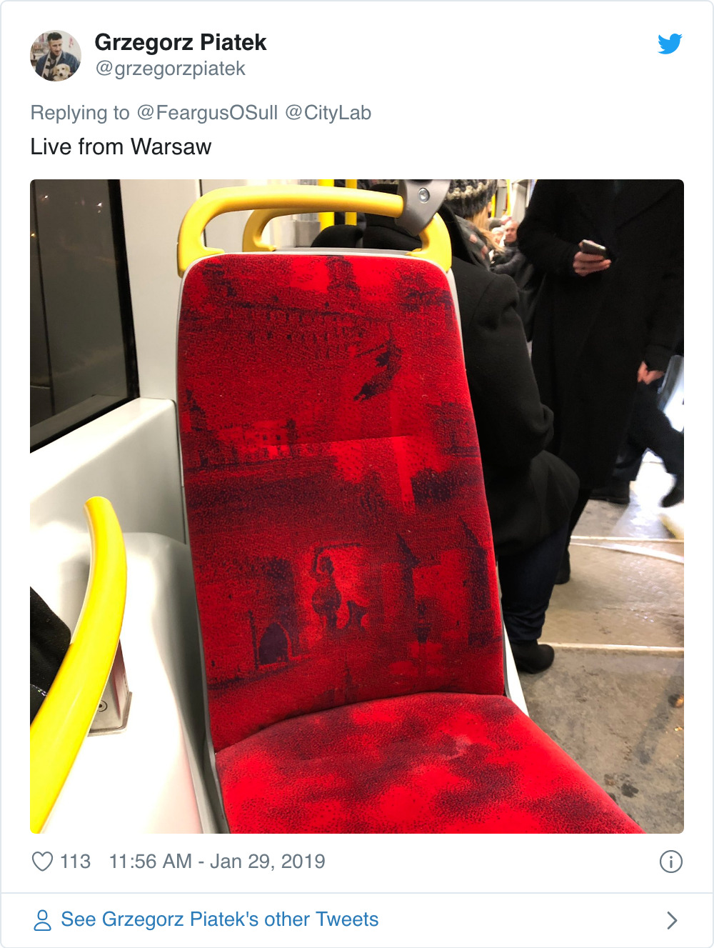
Take Down the Fourth Wall
Recognizable imagery can be great, but every now and then a transit
system goes too far. A seat cover is essentially a washable
butt-and-back cushion; it’s not the ceiling of the Sistine Chapel.
Sometimes commissioners forget this, emblazoning seat with large-scale
depictions of real objects. Some even attempt 3-D illusion, which
provokes the worst sort of dazzle, making the eye unsure whether it
wants to look at the fabric, or through it.
This approach gave us the seat covers of Warsaw trams, covered with
eye-straining, detailed images of the city’s onetime fortifications
against a crimson plush evoking some biblical rain of blood.
The seats in Dublin’s Luas light rail, meanwhile, go so far that
their designers deserve some respect. It’s a confident city that has the
guts to show its monuments apparently sinking Titanic-like into a sea
of fire, but even St. John of Patmos might have considered this moquette
over the top.
There’s always an exception to the rule, however. These
special-edition covers for the Kyoto metro—showing trains, trees, and
little fluffy animals—might be too cutesy for some, but the colors are
charming and dazzle is kept to a minimum by resisting any temptation to
look 3-D. It’s not just the images that work here. In a highly unusual
step for a transit system, the lemon-to-amber fade chosen for the
backdrop is actually rather lovely.
Are these judgements fair? If some of the moquettes above can be said
to fail their brief, then at least they are heroic failures. Seat-cover
fabric designers have to create something that looks pleasant for—or at
least doesn’t actively offend—the eyes of hundreds of thousands of
people. That’s an all-but-impossible task. It’s somewhat cheering that
fabric intended to please as many people as possible ends up being not
bland, but often wildly eccentric. If nothing else, the interiors of
these public vehicles are certainly way more interesting than the
interior of almost any private car.
Feargus O'Sullivan is
a contributing writer to CityLab, covering Europe. His writing focuses
on housing, gentrification and social change, infrastructure, urban
policy, and national cultures. He has previously contributed to The Guardian, The Times, The Financial Times, and Next City, among other publications.