Good for you. Then bad for you. Then good for you again? Photo illustration by Slate. Photos by Thinkstock.
Look at any newspaper, magazine, or website in a given week and you are likely to encounter some coverage of new studies on diet. Fat might be good for you this week, and coffee is bad. Or maybe, fat is bad, and coffee is good. If you are a connoisseur of such articles—say, someone like me who would like to make “evidence-based choices” about health—the ping-ponging of studies and coverage will not have escaped your notice. In fact, you can also find articles—in this publication, among other—pointing out what is already pretty apparent: It’s hard, perhaps even impossible, to think all of these studies are simultaneously correct.
It is easy, especially as someone who is on the research side of things most of the time, to fault the media for sensational coverage of individual studies that fails to consider the broader context. And certainly there is a healthy dose of that all around us (for example, why write a headline like “Do Tomatoes Cause Heart Attacks?” when the answer is “no”?). But I don’t think this is the main problem, and at the very least, it’s not the only one. Instead, I would argue the main problem is that the studies that underlie this reporting are themselves subject to significant bias.
Nowhere is this more true than in studies of diet. Most studies of diet work in a similar way: Researchers take a population of people, ask them questions about their diet (ideally detailed and well-designed ones), and then relate their reported diet choices to outcomes like weight or cardiovascular health. But these studies have an obvious problem, namely, that people do not choose their diet randomly. When you look at one particular food in the data and try to understand its impact, it’s impossible to zero in on the impact of just that food—you’re also seeing the impact of all of the other features that go into determining what food you eat.
In many cases, it is hard to see whether these problems will make food seem better or worse. Take coffee as an example. On the one hand, coffee drinkers are more educated on average, and they exercise more. On the other hand, they also tend to smoke more. It may be these differences—not the coffee—that drive the differences in health. Researchers are supposed to try to adjust for these differences. But depending on which factors these studies are able to adjust for, coffee may sometimes look good and sometimes bad.
Published studies on this often give lip service to this problem, and sometimes the resulting media coverage does too. It goes by many names—residual confounding, omitted variable bias, selection bias, “correlation is not causation.” But too commonly it is a throwaway in both studies and coverage; you’ll see a line like, “A limitation of our study is the possibility of residual confounding,” with little follow-up to give a sense of how large this can be. This often leaves us with the impression that, actually, these concerns are pretty minor. Are they? Or is this problem an endemic curse on studies of diet?
Part of what makes this hard to answer is that it’s difficult to get a sense of the scope of the problem from one-off studies of dietary choices, or even from comparing across published studies with different methods. So instead, I thought I’d take a look at how confounding surfaces in a lot of dietary choices all together, and I’d focus on body weight. I set out to analyze—using a top-notch data set and standard analysis techniques—a simple question: “Which foods make you thin?”
To do this, I started with a data set called the National Health and Nutrition Examination Survey. These data are from a nationally representative survey about the health of Americans. This is a standard and high-quality data set; for example, when you see reports about what share of Americans are overweight or obese, the data for that comes from the NHANES. In this survey, researchers actually weigh and measure people, so we see their actual weight, not what they say their weight is.
This study also includes a comprehensive diet module. Diet data is notoriously hard to collect, but this survey uses the best technique we have, which is a two-day recall. Participants in the survey are asked to recall two days of their food consumption. Literally, they are asked to list everything they ate. This is better than (for example) asking people what they generally eat, although it does tend to understate calories (people forget the cake they had at the office party, the chips they ate in front of the TV, etc.).
Based on these recalls, the data report information on individual diet in extreme detail. We can see a full list of foods people eat—in large categories, like soda, but also very small ones, like blueberries or cauliflower. And once I have this list, I can use regression to link people’s body mass index to their food consumption. I ran a very standard analysis here: estimate the link between BMI and consumption of each food, adjusting for difference in age and gender.
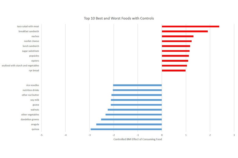
I did this for almost 300 foods in the data—anything where at least a few people in the study ate them. The graph below shows the top 10 “thin” foods and the top 10 “fat” foods. It also shows how much they matter for BMI. For example: In the data, eating quinoa is associated with a whopping 4.2 point reduction in BMI, whereas eating breakfast sandwiches is associated with more than a 2 point BMI increase.
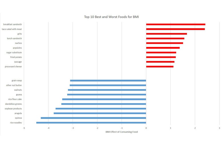
Graphs by Emily Oster.
In some ways, this lineup isn’t surprising—we have a sense that fast food is worse for you than vegetables—but as I looked at the top “thin” foods in particular, it was hard to shake the feeling that something might be driving this other than that these are the best foods. A large share of these—dandelion greens, soy-based products (tofu and tempeh), quinoa—are the kind of foods that (we suspect) are much, much more likely to be consumed by higher income, higher education individuals. In the 2008 presidential campaign, for example, arugula was the poster child for fancy-person food. But people who have higher incomes tend to have better health for a lot of reasons beyond diet.
This point is even more stark if we look within a few categories, meaning let’s look at different types of lettuce, or different types of fat. The graphs below show the BMI effects for a few different food groupings and, below that, the relationship between eating these foods and the person’s education. Once again, I’ve shown foods that increase your BMI in red and those that decrease it in blue. On the second graph, I’ve shown foods associated with higher education in blue and those associated with lower education in red. We see the graphs move together: Within these groups, foods that are disproportionality consumed by more educated individuals are also those that are associated with a lower BMI.
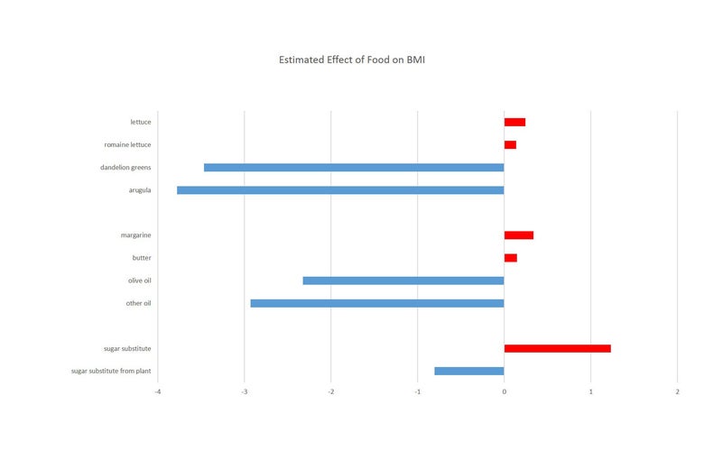
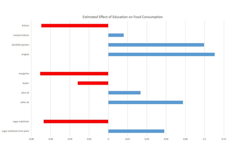
These graphs strongly suggest that education is the more important variable here. Take the greens group as an example. From the data, it looks like dandelion greens and arugula are much more likely to make you thin than romaine, and all are better than standard lettuce. But from the second figure we see clearly that this lines up exactly with which of these are disproportionately consumed by people with more education. And if we think about it, it’s hard to come up with a good explanation of why dandelion greens would actually help you lose more weight than lettuce. None of these things have significant calories.
We can make a similar argument on sugar substitutes. Standard sugar substitutes look like they encourage weight gain, while “fancier” plant-based substitutes cause weight loss. Again, these patterns are hard to reconcile with the fact that neither of these have any calories but may be easier to understand when we see the links with education.
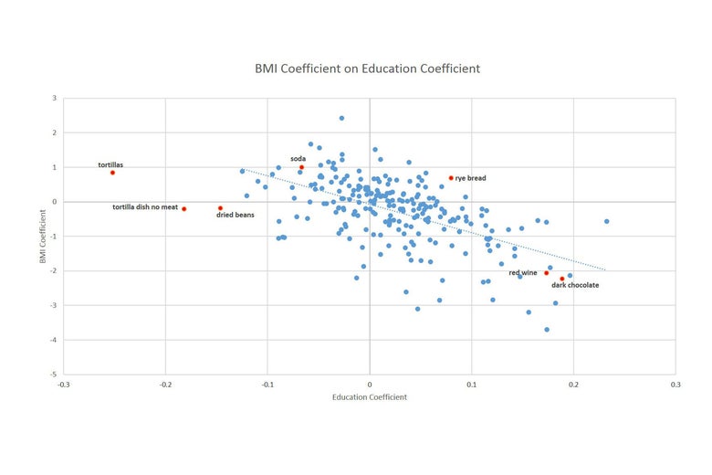
This goes beyond these individual anecdotes. Organizing foods by who buys them is an extremely good way to understand the data overall. The graph below shows on the x-axis the relationship between education and food purchases (further to the right are foods that are more frequently consumed by higher education households), and on the y-axis, the relationship between BMI and consumption (higher values indicate foods more associated with higher BMI). This relationship is strongly downward sloping, which makes clear that the series are closely related.
We can also see a few interesting points. Soda shows up as being bad for weight loss and as consumed by individuals with less education. Red wine, dark chocolate: good for weight loss, consumed by higher income individuals. In the bottom-left quadrant, we see tortillas and dried beans show up as slightly good for weight and consumed by people with less education, and in the top-right quadrant we find rye bread—bad for weight and consumed by people with higher education. This highlights the somewhat obvious fact that education is not the only variable that correlates with what we eat, there are also racial and cultural factors.
To that point, I did this with BMI and education, but I could easily have drawn the same graphs with, say, heart health instead of BMI. Or, instead of education, I could have used income, whether people exercise, or whether they have a regular place for health care. All of these analyses will show the same pattern.
It is too common to brush these off as either unimportant (which they are not) or completely unsolvable (also not true).
The first message I take from this is that the problems with selection in this setting are significant. Those graphs above go beyond confirming that food choices aren’t random—they make clear food choices are closely linked to other important characteristics of people that are likely to drive differences in health.
My analysis above is what we call a “raw correlation.” If you read articles about diet carefully, you’ll typically find a part where the researchers acknowledge that these raw correlations may be driven by selection in behavior. Then they’ll go on to “control for” various things, including (often but not always) education or income. The implication is that adjusting for education should fix the problems.
I can implement the same thing here. To do this, I include adjustments for education in my regression. Effectively, this allows the level of BMI and the level of food consumption to vary with my control education, and looks for any leftover links between just the two noncontrolled factors. When I do this, I go beyond just education and also adjust for income, race, and marital status.
The two figures below replicate two of the above, using these controlled regressions. I’ve put them on the same scale, so they are easy to compare.
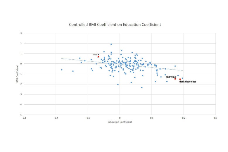
On the one hand, it is clear these adjustments make a difference. In the bottom graph, the line is much flatter, indicating that there was a link between education and health, and it’s been factored out. That’s a good sign for getting to the truth. However: If the only problem was education—if our education variable perfectly captured all the variation across people—this line wouldn’t just be less steep; it would be completely flat. And the foods in the top graph would just look like a random collection of foods—like cereal or peanut butter.
But this isn’t what we see. Our problems are very much still here despite these controls. If you look at the first graph, the foods in our “top 10” and “bottom 10” groups are very similar. A few have changed places or come in and out, but the overall picture is very similar. And while the effects are smaller, they are still enormous. Quinoa now looks like it lowers BMI by 3 points, rather than slightly more than 4, but both effects are incredibly large. And even the second graph, with the flatter line, still shows a significant downward slope. These series are still clearly linked.
What is going on here? Why isn’t it enough to make these adjustments? Why do we still seem to have this selection problem?
It isn’t that these efforts to control for confounding variables do not matter—they clearly do. The problem is that these are not complete. There are still a lot of differences across people that we cannot adjust for. Even if we put more and more variables in the regression, there is simply more about people than you can fully capture in data.
The quinoa effects are a good example for seeing why. Quinoa isn’t just an expensive food that highly educated people like. It’s also a food explicitly associated with health. It’s eaten disproportionately by people like my parents, whose diet is also made up of edamame and Chinese long beans from their garden and who are constantly thinking about ways to be healthier. But there is simply no way that survey data is going to pick that up; we cannot control for this.
In the end, what can we conclude here—what can be done? What does it mean for how we should interpret these studies? This question is even wider than just diet, because the same problem comes up in all kinds of health areas, and in other domains (child rearing, for example, or pregnancy, which I also write about). On the media coverage side, I think there is more that can be done to be clear about the limitations of the studies we cover. If I were writing a different type of article, it would be easier to write the conclusion: I could just say: “Plant-Based Sugar Substitutes Are Better for Weight Loss Than Standard Sugar Substitutes.” Or: “Not Just a Yard Pest: Dandelion Greens Fight Fat!” Those articles would probably get more clicks. But they’d also have the problem of not really being true.
But I think the bulk of the change must fall to how we do research, and how seriously we take these problems. It is too common to brush these off as either unimportant (which they are not) or completely unsolvable (also not true). Randomized controlled trials, which avoid these problems by randomly assigning people to eat some particular foods, would be great. They also happen to be time-consuming and expensive. But if we can learn from data like what I use here, maybe we can learn faster.
I believe we—as researchers—need to make more efforts to develop and use methods that allow us to think about the scope of the problems in this work. We need to be able to think more formally about the possible degree of bias that could result here. This is partially a self-serving comment, since I have some academic work on methods to do this, but there are other ways to think more carefully about this. Challenges will remain, most notably that getting your papers published may require pushing the results harder than they deserve, but if we can encourage more careful scrutiny of these problems, perhaps we can push the publication process as well.
Fixing academic publishing is all well and good, of course, but where does that leave you, the reader who just wants to know what to eat to be healthier? Should you start eating more quinoa or buying the farmers market dandelion greens? I’d say if they look good and you want to try to convince your children to eat them, sure. I, for one, will be sticking with the romaine.